Thoughts on visualizing fitness in karyotype space
Posted: Feb 02, 2022
The publication of our pre-print on advancing quantification of chromosomal instability is nigh. I’m wrapped up a long stretch of revisions for the re-submit and, as a result, have been thinking a great deal about karyotype selection. Ultimately, we want to be able to experimentally quantify selection. We’re not there yet, but how would we represent this when that time comes? Reviews on the effects of selection, in general, are rife with toy visualizations of ‘genotype spaces’. The concept is understandable to me and is easily generalized to the biology of aneuploidy — a ‘karyotype space’. However, I’ve recently been attempting to plot out a fitness landscape for karyotypes and it’s clear I underestimated the difficulty of implementing a useful visualization of karyotypic space.

I want to be clear about what I’m trying to produce. I want a granular landscape where fitness values are defined for every unique karyotype from haploid to tetraploid presented in an intuitive and useful way.
Permutation through karyotypic space
My first impressions of fitness landscapes were conceptual. In reality, there are 423 unique karyotypes between an n of 1 and 4 and I don’t think it would necessarily be useful to consider all 70 trillion+. Let’s consider a smaller karyotypic space of, say, 8 chromosomes. Permuting yields 65,536 unique karyotypes.
library(arrangements)
#Selecting copy numbers 1-4 for k chromosomes
k <- 8
karyos <- as.data.frame(permutations(x=1:4,k=k,replace=T))
Calculating ploidy, aneuploidy, and theoretical fitness of each karyotype
We can now calculate the individual characteristics of these karyotypes that are actually interesting. Ploidy and aneuploidy are pretty easy to calculate as just the average copy number and average intra-karyotype variance respectively. But how do you calculate fitness of aneuploid karyotypes? One way to look at this is through the lens of stabilizing selection—selection against clones with karyotypes that stray too far from a ‘core’ karyotype. Current evidence, at least in non-cancer-derived tissue suggests that aneuploid cellular fitness is negatively correlated to the number of genes on the chromosome(s) for which a cell is aneuploid1,2. For example, aneuploidy of chromosome 1 having a larger fitness detriment than that of chromosome 18 [1,2]. So in this case it’s all about balancing the stoichiometry of expressed genes.
# Sum the number of annotated genes on each chromosome
chrscores <- c(2880 + 2615, 1647 + 2557, 1392 + 1806, 746 + 1917, 710 + 2282, 1541 + 1539, 1082 + 1947, 959 + 1536)

# Normalize the gene abundance of each chromosome to the sum across the karyotype to get relative gene abundance (relative importance to fitness).
chrscores <- chrscores / sum(chrscores

# Calculate the ploidy for each karyotype
karyos$ploidy <- apply(karyos[,1:k], 1, function(x){sum(x)/k})

# Calculate the aneuploidy of each karyotype
karyos$aneuploidy <- apply(karyos[,1:k], 1, function(x){var(x)})

# Calculate the fitness of each karyotype (this takes a few seconds)
karyos$fitness <- apply(karyos[,1:k], 1, function(x){
  f <- vector() #Create a vector to hold the modified fitness values of each chromosome
  for(c in 1:k){
    f[c] <- chrscores[c] - (chrscores[c] * (abs(x[c] - mean(x))))/ mean(x) # Modify the fitness value of each chromosome by how unbalanced it is from the ploidy of the cell.
  }
  sum(f)
})
Great! What did we just do? We generated chromosome scores for chromosomes 1-8; we calculated the ploidy and aneuploidy of each karyotype in the set; and we used these values to calculate the fitness of the karyotype by assuming a balanced (i.e. euploid) karyotype has a perfect fitness with all chromosome scores summing to 1. We also modified the chromosome scores such that chromosomes that were more unbalanced from the ploidy of the cell experienced a fitness detriment, so the sum of chromosome scores for that karyotype would be < 1. There are some caveats to these assumptions like 1) the ploidy of 2.5 indicates the cell is already aneuploid so this may not be the best denominator and 2) the assumption that gains will be roughly equally detrimental as losses, which may not be true in normal tissue due to haploinsufficiency of many genes. Yet I think this is a good place to start.
Let’s plot!
Two-dimensional fitness landscape
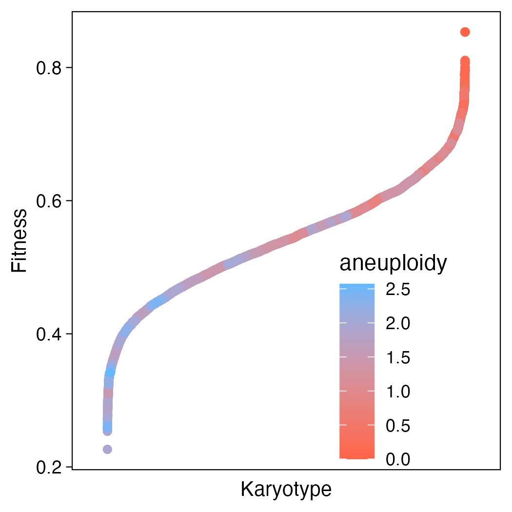
Starting with something super simple. Let’s just consider the landscape of all 8-chromosome karyotypes ordered by fitness.
library(ggplot2)

karyos$id <- rownames(karyos) # Assign an id to each karyotype to easily re-order them by fitness

ggplot(karyos, aes(x=reorder.factor(id,fitness), y=fitness)) +
  geom_point(aes(col = fitness)) +
  theme_pubready() +
  theme(
    axis.text.x = element_blank(),
    axis.text.y = element_text(size = 9),
    axis.ticks.x = element_blank(),
    legend.position = "none",
    axis.title = element_text(size = 10)
  ) +
  scale_x_discrete(expand = c(0.1,0.1)) +
  scale_color_gradient(low="tomato1", high = "steelblue1", limits = c(0,1)) +
  labs(x="Karyotype", y="Fitness")

Okay cool! So what does this tell us? In general, karyotypes that are more aneuploid are less fit! That jives with what we know about the biology of aneuploidy in normal, non-cancerous tissue. But it doesn’t appear to be a clean gradient. Looking closely there are interspersed pockets of blue and red, so this doesn’t give us all the information we need to resolve the full fitness landscape.
Three-dimensional fitness landscapes
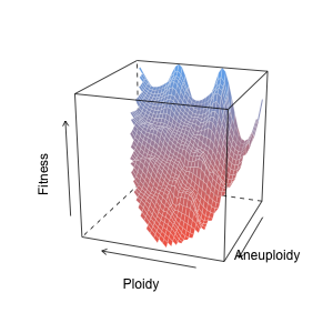
Now let’s shoot for something more like the ‘classic’ fitness landscape — a nice surface plot. Since we already have our x, y, and z (ploidy, aneuploidy, and fitness), we can just go straight to interpolation.
library(akima)
library(lattice)

# Spline interpolation, without extrapolation, and using the median of duplicate datapoints.
interp_fitness <- interp(karyos$ploidy,karyos$aneuploidy,karyos$fitness,linear=F,extrap=F, duplicate="median")

wireframe(interp_fitness$z,
          scales=list(z=list(distance = 1), arrows=T, col = "black"),
          drape=T,
          colorkey=F,
          col='white',
          lwd = 0.2,
          col.regions = colorRampPalette(c("tomato1",  "steelblue1"))(100),
          screen = list(z = -200, x = -70),
          xlab = "Ploidy",
          ylab = "Aneuploidy",
          zlab = list("Fitness", rot = 90, distance = 3),
          par.settings = list(axis.line = list(col = 0)))
That’s looking nice! We can see that fitness generally decreases (blue to red) as aneuploidy increases. Also, because non-integer ploidy values generally indicate some degree of aneuploidy, there is a nice ‘wave’ of fitness along the ploidy axis. It also looks like fitness drops off more quickly at lower ploidy values than higher ploidy values. This concurs with the idea that higher ploidy buffers cellular fitness against the negative effects of unbalanced karyotypes. From a stoichiometric standpoint, with a greater denominator, the cells are just less aneuploid. Yet this still doesn’t tell us much about specific karyotypes and how individual copy number alterations interact to alter fitness.

n-dimensional karyotype space using adjacency networks
So to fully understand how single alterations could change fitness, we need to think of karyotype space as a network, visualizing each unique karyotype as a node, and single alterations that link two karyotypes as ridges. First we need some utilities to calculate manhattan distance between karyotypes.
library(network)
#Function to calculate manhattan distance between two vectors
manhattan_dist <- function(a, b){
  dist <- abs(a-b)
  dist <- sum(dist)
  return(dist)
}

#Function to apply the above to calculate manhattan distances between two karyotypes
pairwise.manhattan <- function(x){
  pairwise.comparisons <- t(combn(nrow(x),2))
  results.matrix <- matrix(nrow = nrow(x), ncol = nrow(x))
  for(i in 1:nrow(pairwise.comparisons)){
    vec <- pairwise.comparisons[i,]
    results.matrix[vec[1], vec[2]] <- manhattan_dist(karyotypes[vec[1],], karyotypes[vec[2],])
    results.matrix[vec[2], vec[1]] <- manhattan_dist(karyotypes[vec[1],], karyotypes[vec[2],])
  }
  return(results.matrix)
}
Alright. Now let’s take a look at the “network” starting with a “karyotype” with only 1 chromosome that can have a copy number of 1-4.
karyo.copies <- 4 #copies from 1-4
karyo.set <- 1 #two chromosomes of a karyotypes
karyotypes <- permutations(n=karyo.copies,r=karyo.set,v=1:karyo.copies, repeats.allowed = T)

# Get the manhattan distance between each karyotype
pairwise.karyotypes <- pairwise.manhattan(unique(karyotypes))

# Convert manhattan distances to intersections. All distances not equal to 1 become 0.
pairwise.karyotypes[is.na(pairwise.karyotypes)] <- 0
pairwise.karyotypes[pairwise.karyotypes != 1] <- 0
pairwise.karyotypes.manhattan.1 <- pairwise.karyotypes
diag(pairwise.karyotypes) <- 0

# Create the network
net <- as.network(x = pairwise.karyotypes.manhattan.1, # the network object
                  directed = F, # network direction not necessary
                  loops = F, # no self interactions
                  matrix.type = "adjacency"
)

# Create an attribute for vertices that represent euploid karyotypes
set.vertex.attribute(net,
                     "Euploid",
                     apply(unique(karyotypes), 1, function(x){length(unique(x)) == 1})
)

# Create labels for each vertex that represent the karyotype
network.vertex.names(net) <- apply(karyotypes,1,function(x){paste(x,collapse="")})

# Make euploid karyotypes orange and aneuploid karyotypes grey
nodecolors <- ifelse(apply(unique(karyotypes), 1, function(x){length(unique(x)) == 1}), "Orange", "Grey")

# Gimme that network plot
plot.network(net,
             vertex.col = nodecolors,
             vertex.cex = 2,
             displaylabels = T,
             label.pos = 5,
             label.cex = 0.6)

As you can see things quickly get out of control as dimensionality increases. And the real karyotype space has 23 dimensions! I think the most visually useful plot was the 3D surface, but that is derived under the assumption that always decreases with aneuploidy. While this is probably a fair assumption in non-tumor tissue, we don’t actually know what that surface looks like. I think these networks are a more interesting way to think about the karyotype fitness landscape, but I think more work is needed to figure out how these could be useful visually. In the mean time, perhaps it would be useful to look at specific copy number interactions in this way?